

One Digital Platform (ODP) enables a consistent online experience across all Canadian Tire banners while streamlining digital operations. I helped with crafting the browse experience for the site.
Timeline & Contribution
I was brought on this project for phase 2 and phase 3 from March 2020 to October 2020. My responsibilities day to day included collecting existing data, competitor analysis, user flows, wireframes, prototyping, user testing, and annotations. I worked with cross-functional teams to ensure all designs were ready for development.
Role
Product Designer
Problem Space
Canadian Tire is well known for its in-store direct selling experiences with customers but lacked behind when it came to their online presence. Canadian Tire has the vision to become the #1 retailer in Canada in 2020. The idea is limited by a lack of centralization, creating a fragmented approach to digital, inconsistent cross-banner experience, and outdated technology and processes.
Outcome
The team and I successfully delivered all variations of the product detail pages, a new header/footer, store locator page, store detail page, and checkout page, which can be used across 14+ banners. Our work made it clear that there were specific barriers to the fulfillment methods and opportunities to improve upon later down the development.
Process
Below is a high level of the process me and my team went through during our time with Canadian Tire. If you would like to learn more about the process in detail, I would be happy to talk more by phone or email.
Strategy
Canadian Tire has the vision to be the #1 retailer in Canada. To do this, we needed to deepen household relationships, simplify customer interactions, and streamline digital operations.
Research
We collected existing data around the features we were working on and had a vital resource around best practices for e-commerce sites that the stakeholder recommended us. Also, to better understand how competitors were doing when facing similar challenges, I took a look and compared over 20+ similar competitors.
Design
When designing the experience, we followed 3 design principles: concise, consistent, considered—all design decisions needed to be data-driven. We worked closely with the data team at Canadian Tire and our team to get the right data to support our decisions.
Iterate
Through countless meetings with different teams and stakeholders, I designed many iterations before signing off on tasks. By conducting user testing with our designs, we were able to apply findings to the designs. This allowed us to check that our solutions and decisions were on track, meeting business requirements and solving the right problem.
Below are the experiences I delivered:

Product Detail Page (PDP)
The product detail page is where customers learn the details about products. Since customers shop online with their eyes first, the image needed to be large, clear, and information-rich. Details about the product were designed to serve different types of online shoppers.
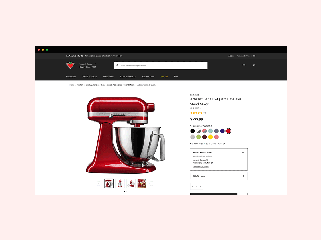
Layout
The detail page uses one long page layout with a sticky table of content and a floating buy box. We found that this layout was best for the different types of online Canadian Tire shoppers through research and data previously collected.

Other Variations
Canadian Tire is well known for selling auto parts to customers. This meant that the detail page had to adapt to the product that the customer is viewing. We created different variations of the detail page to cover all different types of products.
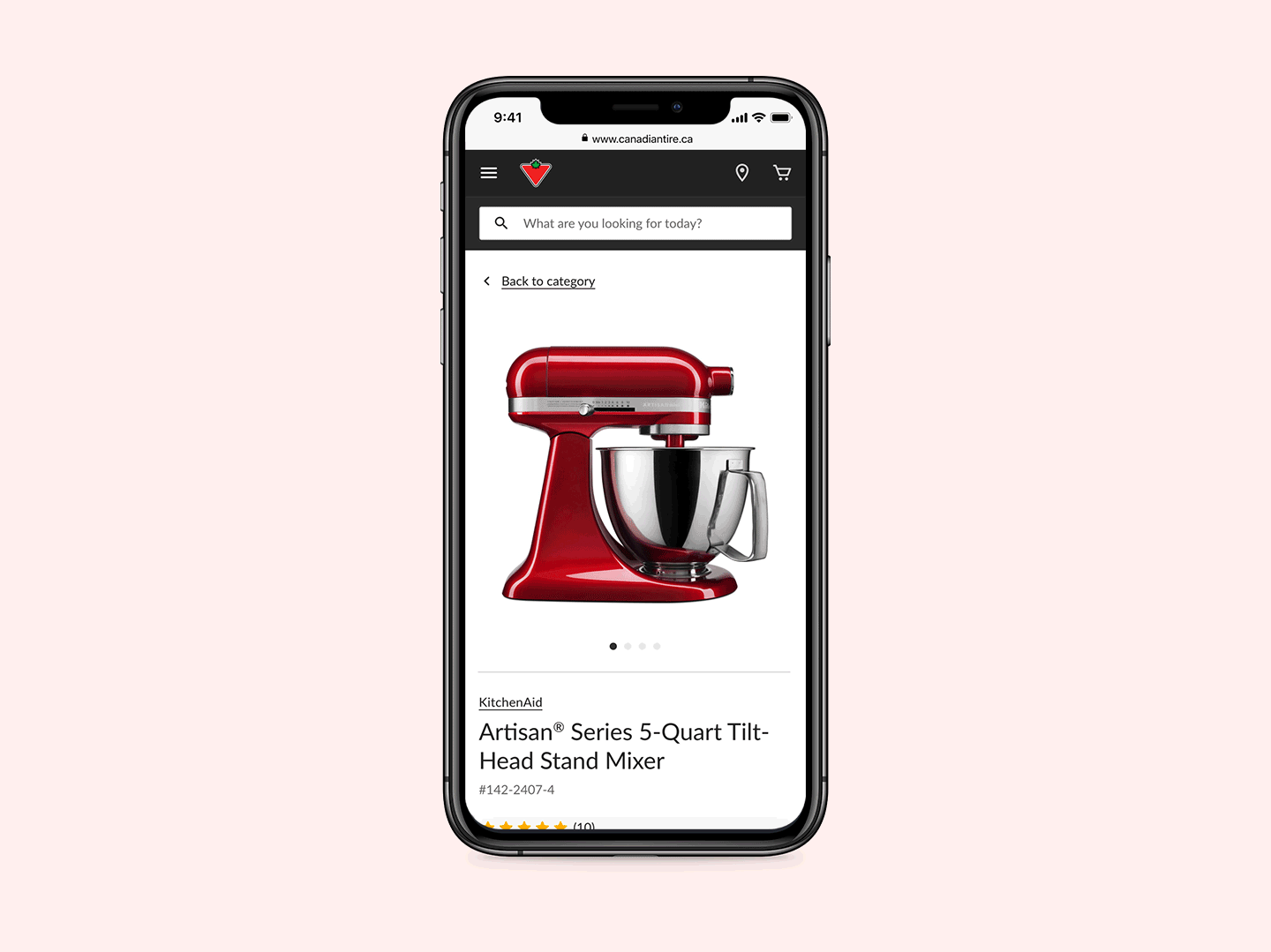
PDP Mobile View
Around 60% of Canadian Tire customers visit using their phones. It was important for us when designing that we always start with mobile-first. We made sure that navigating and adding products to the cart was easy to use.

Store Locator
Finding stores and change stores when shopping through the Canadian Tire site helped users locate products that might be out of stock. We learned that around 17% of products in any selected store might be out of stock on average. This is why we focused on the map and list view to show users where their next closest store was.

Store Details
Not all Canadian Tire retail store is identical to another. Some stores offer more services than others, for example, gas stops, auto centers, and many more. The store details contain all necessary information and the different services that were available to customers.

Checkout
The importance of a quick and easy checkout experience allows for a fast conversion. With the flexibility of allowing customers to choose their fulfillment method, we designed the checkout experience to ensure that customers had all the information needed based on their selected fulfillment.
We also added the feature to show and use CT loyalty points for users with accounts. This not only helped customers save money but also helped Canadian Tire in obtaining a higher brand loyalty.
Takeaways
From the first day to the end of my engagement, this project was challenging and fulfilling. Prioritizing the work at hand helped the team and I work through such a tight timeline. This was also a great opportunity for me to learn about the online retail experience.
Overall this project was a great learning experience. ODP was challenging, and with the added obstacles of working remotely during the pandemic, I am proud to have been able to deliver the work that the other team members and I did.